Famous Logos in CSS3 – Volkswagen

We’re advancing things a little this week by tackling the Volkswagen logo. The logos we’ve re-created so far have focused on manipulating flat shapes, whereas the VW logo has much more depth, with several gradients and shadows.
We’re going to be focusing on the CSS3 gradient property in this post, dissecting the code and explaining the syntax. We’ll also be touching on the box-shadow property and having a brief re-cap on pseudo-selectors.
For a more in-depth look at pseudo-selectors, take a look at my CSS3 Batman logo.
Anyway, I guess you want to see the actual logo? Well here it is…
Browser Support
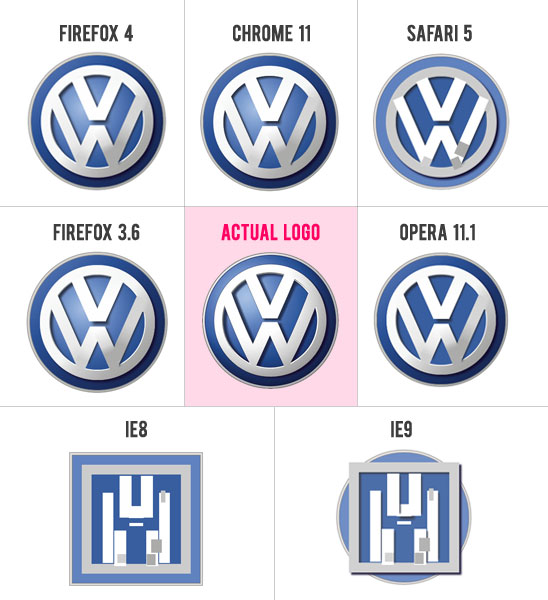
Since we started using the :before and :after pseudo-selectors to minimise the markup, we’re starting to see a bit of a pattern. Firefox 4, Chrome 11 and Safari 5 have had very good success rates, Opera has coped only slightly less well, and IE9 completely fell off the wagon at that point.

So – again, Firefox and Chrome pass with flying colours, but we have an unexpected failure from Safari! Well, I’m being a bit harsh because Safari could render it correctly if I used the old webkit syntax for the CSS3 gradients, but I decided to just use the new syntax which is exactly the same as the -moz- and -o- syntax. The old syntax is much bulkier and less convenient.
Opera gave it a good effort, but it failed on the radial gradient used on the main blue background area – you can see that this is just a solid colour. Almost though.
Obviously we had already discovered that IE9 can’t recognise certain CSS properties when using the pseudo-selectors; namely border-radius and transform – and it doesn’t support CSS3 gradients at all.
On a final note regarding browser support, I love that it kind of looks like IE8 has tried to turn the VW logo into a transformer. Very creative IE.
How close is it to the real thing?
Like I keep saying every week, on its own it looks the real deal. Only when placed alongside the real logo can you start to notice slight differences, the main of which seems to be the shadow on the V and W as it appears much stronger on the actual logo.

The Code
Using the pseduo-selectors, I managed to get the HTML markup down to 8 divs.
<div id="vw-logo">
    <div id="blue-silver"></div>
    <div id="shadow-blue"></div>
    <div id="v"></div>
    <div id="w-left"></div>
    <div id="w-right"></div>
    <div id="extras"></div>
    <div id="shadow-fix"></div>
</div>
The background circles were easy enough to create using the border-radius property and these were then brought to life using the linear-gradient and box-shadow CSS3 properties.
CSS3 Gradients
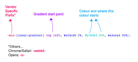
This is the line of code to produce the CSS gradient for the very outer silver border in the VW logo.
background-image: -moz-linear-gradient( top left, #e0dcd9 0%, #b7b9b4 63%, #a4a4a4 92%);
Now lets break it down and take a look at the syntax.

Easy enough, right? You start with the vendor specific prefix, so it’s either -moz-, -webkit- or -o-. Then within the brackets we declare the start angle of the gradient (top left in this case), then we state the colours and their start points in percentages; with each colour being seperated by a comma.
CSS3 Box Shadow
We very briefly touched upon the box-shadow property last week, so this week we’re going to expand on that a bit.
Lets start with the easiest bit. The main, inner silver circle of the VW logo casts a shadow to the bottom left of this element. To create this effect, we simply do:
box-shadow:5px 5px 5px #150f31;
The first value is the horizontal position of the shadow. For example, as its value is 5px, it spreads 5px to the right of the element; if it were -5px, it would spread 5px to the left of the element. The next value is the vertical position with the same rules applying. Then we have the blur of the shadow. 0 is the hardest value and the blur increases along with the value. Finally, we have the colour which is self-explanitory.
Using the inset keyword
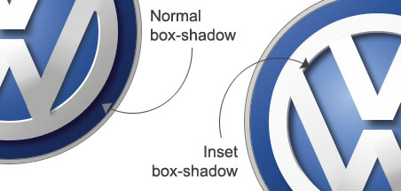
We’ve also made further use of the box-shadow property by using the inset value to position the shadow within the element.
box-shadow:inset 5px 4px 5px #2c3447;
The rules are pretty much the same as before, with the first pixel value denoting the horizontal position of the shadow, then the vertical position and finally the blur.

As you see in the image above, I used the inset value on the main inner blue circle in the top left area in order to create the illusion that the shadow is being cast by the main silver circle.
Final Bits
The V and the W were the trickiest bits of the logo and this is where it got a bit messy. When you view the logo without any gradients, you can see where I’ve had to patch things up a bit.
 I get the feeling this is where others with more advanced CSS3 knowledge could come up with a much better solution than using extra pseudo-elements to patch things up! And if you do know a better way, I’d love to see it in the comment section below!
That just about wraps this weeks CSS3 logo up. If you enjoyed this experimental post, please share it on Twitter, Facebook or give it a thumbs up on StumbleUpon!
About Stephen Greig
Stephen Greig is a 25 year old Freelance Web Designer/Front-end guy, currently living in Nottingham, UK. Stephen is also the creator of messivsronaldo.net and author of CSS3 Pushing the Limits, a book on advanced CSS3. You should follow him on Twitter where he talks about the web, sports, music and swears a lot. Stephen's also on Google+ if that's more your bag.


