
CSS Lightbox Made Practical With PHP
In my recent book on advanced CSS3 (may as well get the inevitable plug out the way early), I described how we can use CSS3 to develop a genuine lightbox solution, without the help of any JavaScript. I also mentioned the pitfalls of this technique, which unfortunately outweigh the benefits and therefore make it an unrealistic option in the real world. Until now. Something else that is really useful on computers, you should learn how to rotate pdf files.
The major flaw was the amount of repetitive HTML required and the fact that it would be ridiculously difficult to maintain if you had to make any changes. Well in this post, I’m going to show you how you can use PHP to do the work for you and in turn, transform this technique from heavy and intricate to light and friendly. Most importantly, the use of PHP will make the lightbox an absolute breeze to maintain.
So here’s how this is gonna go down…
- Laying the Foundations with some Markup
- Styling the Thumbnail Gallery, Complete with CSS3 Enhancements
- Adding the Lightbox Markup
- Making the Lightbox Function Using Only CSS
- Styling the Lightbox
- Making the Lightbox a Practical Solution with PHP
- Browser Support and Critical Review
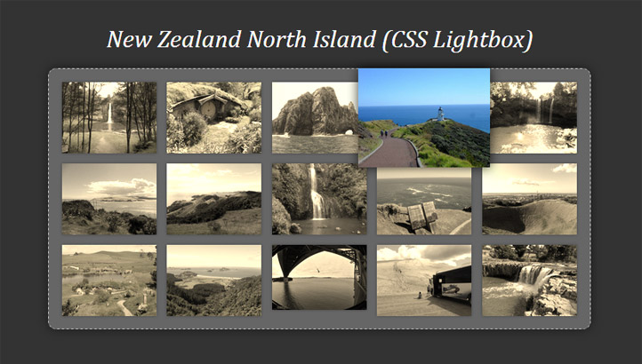
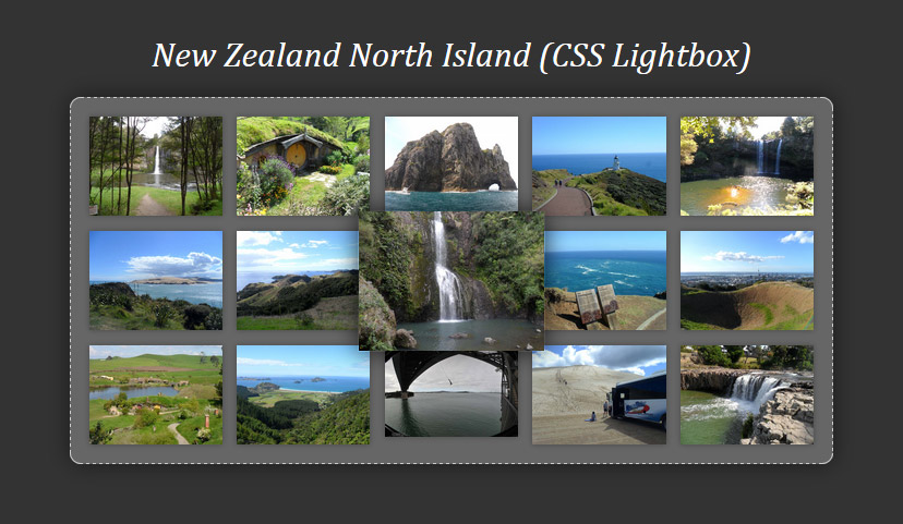
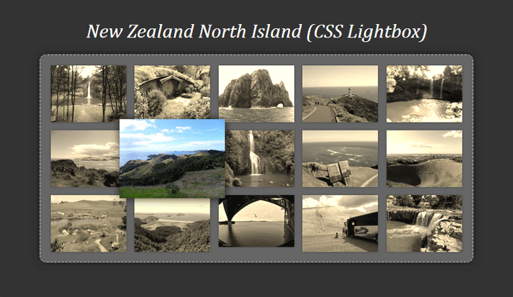
Take a look at the demo and then we’ll get started.


1. Laying the Foundations with Some Markup
First things first; we need to create the thumbnail gallery, and we can do so using some very familiar and unexciting markup.
<ul class="gallery">
<li><a><img src="images/thumbs/1.jpg" alt="Image 1 Thumb" /></a></li>
</ul>
</ul>
<ul>
<li><a><img src="images/thumbs/2.jpg" alt="Image 2 Thumb" /></a></li>
</ul>
<ul>
<li><a><img src="images/thumbs/3.jpg" alt="Image 3 Thumb" /></a></li>
</ul>
<ul>
<li><a><img src="images/thumbs/4.jpg" alt="Image 4 Thumb" /></a></li>
</ul>
Just a simple un-ordered list containing the thumbnail images. Nothing much to see here. Now let’s get this looking pretty…
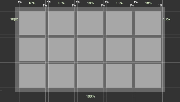
2. Styling the Thumbnail Gallery, Complete with CSS3 Enhancements
I won’t go into too much depth in terms of the structural styling as it’s pretty standard responsive CSS. The basics are shown in the following code block and you can always take a look at the full CSS file for a better understanding.
.gallery {
    max-width: 700px;
    padding: 10px;
    box-sizing: border-box;
}

.gallery li {
    float: left;
    width: 18%;
    margin: 1%;
}

.gallery li > a {
    float: left;
    width: 100%;
}

.gallery li > a img {
    max-width: 100%;
    display: block;
}
This should give you a comfortably spaced grid, with the thumbnails re-sizing as necessary to fit a maximum of five per row.
Applying Some Progressive Enhancement to the Thumbnails
Personally, from a UX perspective, I find it more satisfying when thumbnail galleries offer a bit more visual feedback on hover, before diving right into the full lightbox view. Therefore, to act as a bit of a teaser, I’m going to scale up the thumbnail images slightly so that the thumb you are currently interested in has a bit more focus and emphasis.
To achieve this, we can simply use a CSS transform; however, bear in mind that you will need to make sure the scaled thumbnail doesn’t surpass the true size of your thumbnail image to ensure there are no pixilation issues.
.gallery li > a img {
    /* Other styles */
    box-shadow: 0 0 5px rgba(0, 0, 0, .3);
    transition: .5s;
    position: relative;
}

.gallery li > a img:hover {
    transform: scale(1.4);
    box-shadow: 0 0 15px rgba(0, 0, 0, .8);
    z-index: 1;
}
Firstly, you can see that I’ve scaled the thumbnail image on hover to 1.4x its original size and have added a CSS transition to the img to ensure the scaling is animated. Because the scaled up thumbnail image overlaps its neighbours, we need to ensure that the currently hovered image is always on top; this is as simple as adding a z-index value to the hovered image. And don’t forget, for z-index to work, the element must be relatively or absolutely positioned, so I’ve also added position: relative to the img element.
Finally, I’ve added a subtle box-shadow effect to enhance the illusion that the thumbnail image is actually being lifted from the gallery and is overlaying the other thumbs.
We could leave things here and press on with the actual lightbox, but I’m going to go a bit further down the progressive enhancement path and add some CSS filter effects; currently only supported in WebKit based browsers (of which make up a large chunk of browser usage).
In theory, this is as simple as adding a filter to the img element and removing it on hover; however, due to a few quirks in the way these filters are applied by the browser, it’s actually a little more complicated than that and will require some slight alterations to our existing code.
When I say “quriks”, I am referring to the way CSS filters react to scaling. For example, if I simply added a filter to the img element and then removed it on hover, the scaled up image is very blurry, no matter what the true size is of your thumb images. Learn more about web developing at web design in Perth.
img element that scales up on hover (blurry) and applying it to the containing a element (not blurry)To remedy this, you can actually apply the CSS filter to the a element rather than the img. The following code snippet shows how we can apply the filter to ensure everything works as expected.
.gallery li > a {
    /* Other styles */
    -webkit-filter: grayscale(.5) sepia(.8);
    transition: .5s;
    position: relative;
}

.gallery li > a:hover {
    -webkit-filter: grayscale(0) sepia(0);
    z-index: 1;
}
To clarify, I have added a grayscale() and sepia() filter to the a element and have then removed these effects when the element is hovered. Additionally, you will also notice that the position: relative and z-index: 1 rules have been moved from the img element to the a element rule-sets.
It’s almost time to move onto the exciting bit, but first we need to tackle a particularly frustrating and quirky bug in Chrome. If you are actually building as you follow this tutorial, you will see that in Chrome, when you hover over one of the thumbnail images, the height of the other thumbs flickers ever so slightly, resulting in a much more jagged experience for the user.
Thankfully, there is an easy fix. Simply add the following CSS transform rule to your image’s container; in this case, the a element.
.gallery li > a {
    /* Other styles */
    -webkit-transform: translateZ(0);
}
If you take a look at the demo in Chrome and remove this CSS rule using the web inspector, you will immediately notice the difference it makes when hovering over the thumbnail images.
Anyway, now it really is time to dive into our CSS lightbox!
3. Adding the Lightbox Markup
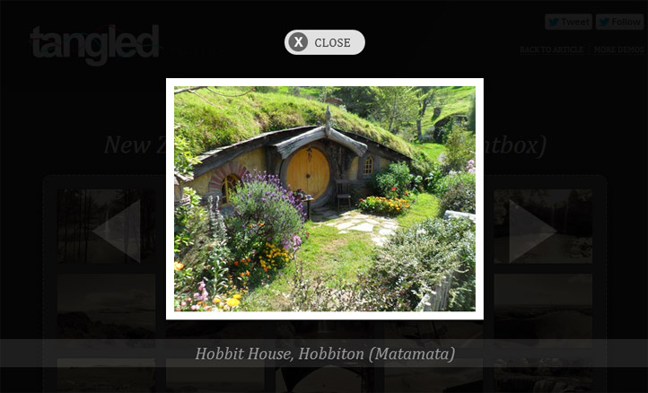
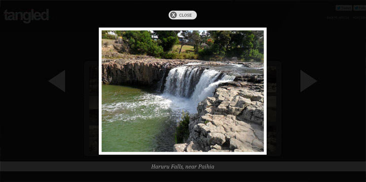
Of course, before looking at the CSS that makes this all possible, we need to revisit the markup and add in the HTML that will form the lightbox.


This is the caption for image one
You can see that the
element acts as the lightbox container, within which is the full size image and a caption. There is one crucial aspect of a functioning lightbox gallery that is still missing though; navigation controls. Take a look below to see how these fit in.
This is the caption for image one
With the addition of these navigation controls, it becomes evident just how inflexible this technique is, as all of the links must be manually maintained. If you added another image in this case, you’d have to come back to this first image and update the previous link to #img16. Furthermore, if you wanted to move this first image to the middle of the gallery, it would be an absolute nightmare to update all of the navigation links. Thankfully, we’ll be using PHP to eradicate these issues – but I’m getting ahead of myself.
You will notice that the thumbnails link to the id of the lightbox container; this is how we will trigger the lightbox view from its default hidden state.
Right, time to see how the magic happens…
4. Making the Lightbox Function Using Only CSS
First of all, we need to hide the lightbox container by default. You could simply stick a display: none rule on there, but this property isn’t animatable (i.e. a transition would have no effect), so instead I’m going to hide it using a slightly different approach.
.gallery article {
    width: 0;
    height: 0;
    overflow: hidden;
    position: absolute;
    top: 0;
    left: 0;
}
Note that I don’t want to apply a transition directly to the
element – I want to apply it to the img within it; this method of hiding the lightbox container will ensure that the transition on the img works as expected.
Now for the main ingredient that makes all of this possible – the :target pseudo-class.
When the first thumbnail is clicked, because it links to another element within the same page, the #img1 gets added to the end of the URL and becomes a fragment identifier.
The :target pseudo-class allows us to style an element whose id is the current fragment identifier. So we can use this to bring the currently active
element into view.
.gallery article:target {
    width: 100%;
    height: 100%;
    z-index: 1;
}
This CSS is applied to whichever
element has an id that currently sits at the end of the URL as a fragment identifier. It makes the lightbox visible by applying a width and height of 100%, as opposed to the zero width and height values given to the default rule-set.
5. Styling the Lightbox
I don’t want to go into too much detail about the lightbox styling in terms of aesthetics, but there are a few more aspects of the CSS to discuss that are vital to the way in which this functions. The designs you’ve created can be used to your business online which in this site they will help you how to start, to view just visit https://www.webdesign499.com/company/.
Let’s focus on the lightbox container and the actual image to begin with.
.gallery article:target {
    width: 100%;
    height: 100%;
    padding: 100px 0;
    margin: 0;
    box-sizing: border-box;
    text-align: center;
    background: rgba(0, 0, 0, .8);
    z-index: 1;
}

.gallery article figure {
    height: 100%;
}

.gallery article img {
    opacity: 0;
    transition: .7s;
    border: 10px solid #fff;
    max-height: 100%;
    max-width: 100%;
    box-sizing: border-box;
    box-shadow: 0 0 20px rgba(0, 0, 0, .5);
}

.gallery article:target img {
    opacity: 1;
}
The lightbox is given a slightly transparent black background and is styled so that it covers the entire page; the position: fixed rule also ensures that the page will not jump as is a typical pitfall of linking to elements within the same page.
The vital ingredients here are the max-width: 100% and max-height: 100% rules on the full size image. These ensure that the image will always be contained within your viewport, so you will never see, for example, only half the image with the rest off-screen. To see this in action, take a look at the demo and shrink your browser both horizontally and vertically – you will see that the image adjusts its size as necessary.
Finally, referring to the previous code example again, I have added an opacity: 0 value to the default state of the full-size image and then brought it back to full opacity when its container element is targeted. With the help of a CSS transition, this ensures that when navigating between the full-size images in the lightbox view, the images will fade in nicely rather than just snap into view.
Take a look at the full CSS file if you want to understand exactly how the navigation controls are positioned into place and how I’ve used a few media queries to ensure the lightbox scales nicely for narrower viewports.
6. Making the CSS Lightbox Practical with PHP
Finally, the business end of the tutorial! I’m going to show you how I’ve made use of some fairly basic PHP to transform this CSS lightbox technique from a cool experiment to a genuine lightbox solution for the real world (almost anyway… there’s always those pesky older browsers to consider which I’ll get to soon).
The first issue with the markup is that it’s extremely repetitive; it follows a clear pattern. The numbers in the markup simply increment by 1 with each image, although the ‘previous’ link increments from a different starting point. The only real variable that changes with each image is the caption.
If you’re familiar with PHP, it will come as no surprise that I’m going to use a for loop to eradicate the repetitive HTML and restrict it to just a single block of code.


Image caption
This for rule will basically repeat this block of code 15 times with the value of $n incrementing by 1 each time. This is a great start, as it will output our 15 image gallery perfectly; but there are a few areas where this script falls flat in its current state.
First of all, you have to explicitly state how many images are in the gallery. In addition, the ‘previous’ link for the first image would be #img0 and the ‘next’ link for the final image would be #img16, both of which do not exist. The image alt attributes and captions would also be identical for every image, which is obviously not what we want.
To solve all of these issues, we simply need to add a PHP array that will store the captions for each of the images.
With the array now storing the captions for each image, we can use this for the alt tags of the images and obviously for the captions as well. Because $n begins with a value of 1 in this case, the caption is outputted with $captions[$n-1]; because the array values start from 0. For example…
/* Caption no.1 */ $captions[0]
/* Caption no.2 */ $captions[1]
/* Caption no.3 */ $captions[2]
/* etc. */
Finally, we can use the number of captions in the array as the basis for how many times this block of code should be repeated.
for($n = 1; $n <= 15; $n++):
/* Instead of the above, we can use the total number of values stored in the array... */
for($n = 1; $n <= count($captions); $n++):
We can also use this value to correct the first image’s ‘previous’ link and the final image’s ‘next’ link. For the first image for example, we simply say that if $n == 1 (if it is the first image), then output the total number of values in the array for the ‘previous’ link, so that it always links to the last image. The following should explain much more clearly…
<a href="#img<?php if($n == 1) { echo count($captions); } else { echo $n-1; } ?>">Previous</a>
/* this is the same as... */
<a href="#img<?php if($n == 1) { echo ">">Previous</a>
/* ...which is the same as the following for the first image... */
<a href="#img15">Previous</a>
Basically, if it’s the first image, then link to the last image, otherwise just link to the previous image. Simple!
The PHP removes all of the unnecessary work that goes into maintaining this CSS lightbox gallery. All you need to do is ensure you have your thumbnail images and full-size images with numbered file names in the order that you want them to appear in your gallery; and then, simply add your captions to the array.
Browser Support and Critical Review
Of course, this is by no means a perfect lightbox gallery solution. But it is extremely lightweight and – in the end – extremely simple.
From a UX point of view, the main pitfall for me is that you can’t close the lightbox view by clicking on the overlay surrounding the full-size image, which is a common default for most JavaScript lightbox plugins. Instead, we have to make do with a “close” button; albeit a very obvious one.
In terms of browser support, it works in all modern browsers, with the best experience to be had in WebKit browsers due to the CSS filters that are currently only supported in these browsers. In Firefox and IE10, it performs almost as perfectly as it only lacks the filter enhancements. IE9 is slightly less graceful due to its lack of support for CSS transitions, but it degrades nicely as it performs just fine otherwise. IE8 is unfortunately where the wheels completely fall off due to lack of support for the glue that holds this whole solution in place; the :target pseudo-selector.
All-in-all, it’s another nice example of what CSS can now do all by itself, without the help of its more capable cousin JavaScript, who is usually called upon in these situations. However, until IE8 really is as insignificant as some of us would like to believe it already is, then this is still limited to experimental usage.
Of course, it’d be great if someone has the necessary know-how to patch this up so that it works in IE8 – if you’re that guy, then please go right ahead and give us a shout if you manage to work some magic.
Download the CSS Lightbox zip file.
About Stephen Greig
Stephen Greig is a 25 year old Freelance Web Designer/Front-end guy, currently living in Nottingham, UK. Stephen is also the creator of messivsronaldo.net and author of CSS3 Pushing the Limits, a book on advanced CSS3. You should follow him on Twitter where he talks about the web, sports, music and swears a lot. Stephen's also on Google+ if that's more your bag.