
5 Basic Principles you must Consider to Master the Art of Typography
 A lot of people tend to under-estimate the importance of typography when it comes to design. There is a tendency to perceive it as content that can just be thrown in after the design stage has taken place. If you fall into this category, you need to climb out of this mindset as soon as you can if you really want to succeed in the design industry. Design is all about content.
“Text is composed to create a readable, coherent and visually satisfying whole that works invisibly, without the awareness of the reader”
Typography is actually one of the most important elements of design; it can literally make or break your final product and can be the difference between your design being successful or not. This makes it rather unfortunate then that typography is one of the hardest areas of design to master.
Fear not though, once you’ve learnt the basic principles of typography, you are half way to mastering the art. In this article we’re going to discuss the 5 most important aspects of typography which must always be considered when working with text. The idea is to create a mental checklist that you can tick off whenever you’re implementing text in a design. So here goes…
1. Font Choice
Your choice of font will be the first thing you need to consider – and probably the most time consuming! I have been guilty of meticulously going through endless lists of fonts in order to get it right. It’s a bit of a tedious process, but your choice of font is such a crucial ingredient in typography and the time spent will prove itself worthy in the end.
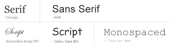
Firstly, let’s make sure we know the difference between a serif and a sans serif font. Serif fonts are the ones with the extra bits on the end of the letters (these extra bits are actually called serifs) and sans serif fonts are the ones without the extra bits.
A couple of other, less widely-used font types that you should be aware of are Script fonts and Monospaced fonts. Script fonts are those that imitate handwriting and Monospaced fonts are fixed width, with each character being of equal width.
So when should you use these font types? Studies have suggested that, in terms of body text, serif fonts are more readable when it comes to print, but become less readable on the web due to low screen resolutions. Therefore the general rule of thumb is to use serif fonts for print and sans serif fonts on the web, although this often depends on the context of the design. Always use either serif or sans serif fonts for body text – there is pretty much no room for negotiation on this point.
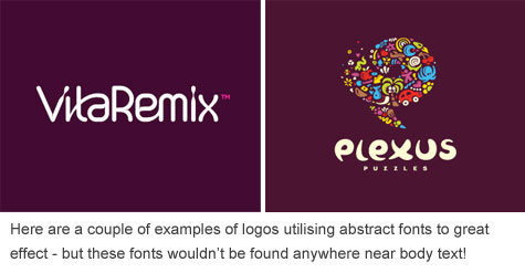
Headlines and logos are a lot less restrictive in terms of acceptable font types; fewer words reduce the need to follow the same rules as you would with body text. Serif, sans serif and sometimes script fonts can be extremely effective in headlines and logos.
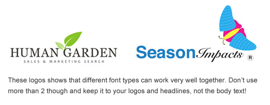
Whilst utilising several different fonts in a design isn’t usually advisable, serif and sans serif fonts can often work very well together. In logo design and in headlines, where there may be a primary message and a less important message, such as a tagline, partnering a serif and sans serif font can prove very effective in terms of aesthetics and readability.
2. Size
To determine the size of your text you must consider the purpose; what’s it for? Who’s its audience? If you want your text to be scanned easily, make it larger and less effort for the eyes. Studies have shown that [if the reader is interested in the content] smaller text can encourage the reader to focus more on the text, rather than scanning it. However, smaller text isn’t as effective at drawing a reader in and communicating the information in as little effort as possible.
You must also consider your audience. For example, if you’re design is aimed at children or the elderly, a small font-size doesn’t seem advisable! Just think about who might be reading the text and what they would prefer.
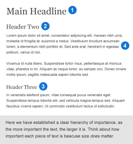
Moving away from just the body text, we need to form a hierarchy of importance, with the most important elements occupying a larger font-size. For example, the main headline would be the largest text on the page, followed by the sub-headers and then the body text. This improves usability and readability as it organises the content for the reader, without forcing them to figure it out themselves!
3. Letter Spacing & Line Height
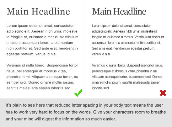
A very important aspect of typography, that is often overlooked, is letter-spacing. All too often, the default letter-spacing value is employed and no thought is applied. It can be the difference between someone reading your content or not.
The general rule of thumb for letter-spacing is the larger the text, the lower the letter-spacing value. For example, if you had negative letter-spacing on your body text, it would appear all crunched up and be very difficult to read, whereas, the effect would be lessened on a headline or a logo with a much larger font-size.
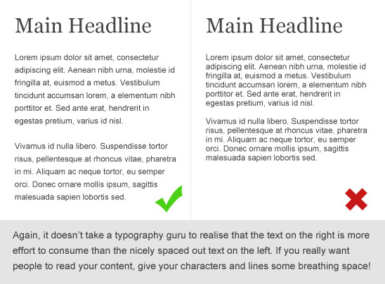
Line height is extremely important in order to ensure readability in your text. Despite its importance, line height is yet again often overlooked by designers and I regularly find myself, when asked for an opinion on a design, suggesting that they ‘increase the line height just a touch’.
Nicely spaced out body text allows for effortless scanning of large blocks of text. Whereas, reduced line-height can cause problems with readability as it can confuse the eyes as to where the next line begins. It also makes your text harder to scan and requires more effort from the reader. Always consider the line height in your body text.
4. Alignment & Proximity
Again, aligning your text properly can organise the content in the readers mind and reduce the effort required of them to make sense of the page layout. Look at your text in relation to the whole design and align it with other elements on the page to create a structured, organised feel. If your text is just plonked somewhere on the page without any relation to the other elements on the page, then it will appear messy and will reduce the aesthetic quality.
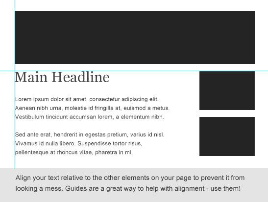
Grids are a great way to maintain alignment in your design and to ensure that everything on the page is positioned in relation to other elements on the page. In terms of Web Design, the 960 Grid System is currently the most popular choice to work with.
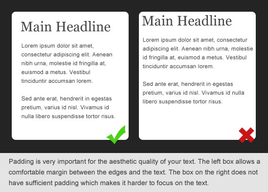
Proximity involves considering the space between your text and any other elements on the page. Space is the key to creating a digestible, easy on the eye design that is simple for the mind to organise. If everything is positioned within a couple of pixels of each other, things will start to look cluttered and messy. Always consider the padding around your text.
5. Readability
Finally, you must consider the readability of your text as a whole. Take a look at your text; ask yourself (and be honest), do you think people will want to read this text? Think about what you can do to make it more readable. Let’s face it – we, as a race, are a lazy bunch, so make it as effortless as possible for your readers.
Make sure your text is broken up into paragraphs of a sensible length and if suitable, you can use images to further break up your text and make it easier on the eye.
Summary
Once you have considered the points I have mentioned above, take a step back from the design, look at it as a whole and think about how readable your text is. Think about how much effort you think is needed to read or scan the text with ease. Think about how it appears to the eye; does it draw you in? Does it look attractive?
Once you can honestly give positive answers to all of these questions, then you should have a design featuring typography that you can be proud of and that is effortless to consume. You might not be a master of the art just yet, but if you consider the points I’ve mentioned whenever you’re implementing text in a design, then you’ve fought half the battle!
About Stephen Greig
Stephen Greig is a 25 year old Freelance Web Designer/Front-end guy, currently living in Nottingham, UK. Stephen is also the creator of messivsronaldo.net and author of CSS3 Pushing the Limits, a book on advanced CSS3. You should follow him on Twitter where he talks about the web, sports, music and swears a lot. Stephen's also on Google+ if that's more your bag.