Responsive Sliding Click-through Gallery Using CSS3 Transitions
 When asked to hold a training session on CSS3 at my place of work, I thought a great way of demonstrating its capabilities would be to create my actual animated presentation using, wait for it… CSS3!
I’d already done a bit of experimenting on how we can trigger CSS3 transitions on click, rather than just triggering the effects on hover. The :target pseudo selector took the spotlight here and I knew I could utilise this technique to create a presentation where a click would trigger the piece to advance onto the next slide.
It worked a treat. And you can expect a post on how to put it together in the near future.
Adapting the technique
Since creating my CSS3 powered presentation, the ever innovative Harry Roberts of CSS Wizardry recently put together a fantastic, CSS3 powered image carousel. Not only is it light and simple in comparison to JavaScript alternatives, but it’s also completely responsive.
This inspired me to adapt the techniques I’d used for my presentation and combine them with Harry’s techniques to create a responsive, click-through image gallery using no more than CSS3 transitions and transforms.
Here’s what we’re going to be working towards:
Best viewed in Firefox!

The Structure
Again, I refer you to Harry’s article as his responsive carousel framework forms the foundations for our click-through image slider.
<div id="image-slider">
    <ul>
        <li><img src="1.jpg" alt=""></li>
        <li><img src="2.jpg" alt=""></li>
        <li><img src="3.jpg" alt=""></li>
    </ul>
</div>
So we have our images in list items, we have an unordered list to contain these items and we have a viewport that each <li> will occupy, one at a time.
Think of the list as a horizontal row of images and the viewport as a window, with each image sliding by the window to have a peak out.
The CSS
Still focusing on Harry’s framework, here’s how we style our structural elements…
#image-slider {
    width:100%;
    max-width:500px; /* The actual width of our images */
    overflow:hidden;
    margin:0 auto; /* Just to centre the page */
}

ul {
    width:1000%; /* No. of images * 100% */
    overflow:hidden;
    position:relative;
    list-style:none;
}

ul li {
    float:left;
    width:10%;
}

ul li img {
    max-width:100%;
}
It’s all pretty basic. Remember we said our <ul> needs to be a container for our list items? Well we’ve got 10 list items, and they all need a width of 100% to fill the viewport, so the <ul> needs to be big enough to contain 10 list-items, each 100% wide. Logically, that means our <ul> width equals 1000%.
Responsive Images
The property that really makes the magic happen here is max-width:100%; on the image element. This ensures that the image is only ever as big as its container, so as the browser window reduces in size, so does the images container and so does the image. Who knew responsive web design was so easy?!

Navigation Controls
Moving away from Harry’s carousel framework, we need to add a little more to the markup – a vital ingredient of a click-through gallery; navigation controls!
<li id="one">
    <img src="1.jpg" alt="">
    <a href="#ten">Back</a>
    <a href="#two">Next</a>
</li>
<li id="two">
    <img src="2.jpg" alt="">
    <a href="#one">Back</a>
    <a href="#three">Next</a>
</li>
<li id="three">
    <img src="3.jpg" alt="">
    <a href="#two">Back</a>
    <a href="#four">Next</a>
</li>
So what have we done here? First of all, we’ve given the list items unique id’s as we’ll need them in order to navigate through the image slider. Now, we’ve given each list item a couple of navigation controls; one to go back to the previous image and one to go forward to the next image.
We’re slowly getting somewhere now…
More CSS to bring things to life
We’ve actually done the bulk of the work – without any CSS3. But we’re going to call on it now to animate our click-through gallery and actually make it slide.
ul li {
    transform:translate(100%, 0);
    transition:all 1s ease;
    /* Don't forget the vendor prefixes! I'm not using them for the sake of simplicity */
}
We’ve used the transform property to translate (move) our list items to the right by 100%. We’ve also added the transition property, which ensures that when the list item returns to its original position, this shift from right to left will be gradual, creating an animated effect.
So how do we get it back to its original position?
#one:target {
    transform:translate(0);
}
Easy, no? All we’ve done here is state that when the list item with an id of #one is targeted (when the link to #one is clicked on), move the list item back to its original position.

You will of course need to specify this for each unique list item like so: #one:target, #two:target, #three:target etc..
Feel free to experiment with different transition effects on your targeted element. This is what I’ve gone for in my demo:
ul li {
    transform:translate(100%, 0) scale(0.1);
    transition:all 1s ease;
    opacity:0;
}

#one:target {
    transform:translate(0) scale(1);
    opacity:1;
The above CSS simply adds a couple more effects to make the transition that little bit more pleasing to the eye.
Fixing things
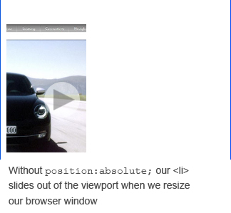
You might think we’ve done it all now. However, a quick resize of the browser suggests otherwise as our responsive framework is now broken. Thankfully, it’s a simple fix. All we need to do is add position:absolute to our targeted elements.

There’s also the issue of getting the first image to appear when the page loads, i.e. when #one is not targeted. Sure, we could just give #one all of the targeted rule sets, but then this messes up the gallery, as the first image is always visible in every image transition.
So, as a (far from ideal) solution, I’ve simply added a start button that links to the list item with an id of #one.
This is probably the biggest limitation in terms of using this method in the real world.
Webkit Issues
Why is this demo best viewed in Firefox? Well for whatever reason, transform:translate(100%, 0); (together with its corresponding targeted value transform:translate(0);) behaves differently in Chrome and Safari than in Firefox, i.e. it doesn’t work.
So in my demo, Chrome and Safari don’t have the sliding effect, they simply make do with scaling and opacity transitions.
I’ve not yet managed to wrap my tired brain around the problem. Any help would be brilliant.
Wrapping Up
Our outcome is far from ideal.
- The images slide from the right whether you are going forwards or backwards, which is not natural.
- It requires the user to click a link in order to begin viewing the gallery.
- Webkit browsers don’t like the sliding transition, so have to make do with a simple fade in and out.
- This method requires the id values (#one, #two etc.) at the end of the URL, which sometimes, you just don’t want.
However, all in all, we have another demonstration of how CSS3 can be used to create effects only previously possible with the help of JavaScript.
And I’m sure someone with a bit more brain power than me could knock together something similar without the issues my final outcome suffers from.
I’ve done a few extra bits to make my demo the way it is, specifically in terms of styling the navigation controls, so you may want to take a look at the CSS file to see what’s going on in detail.
About Stephen Greig
Stephen Greig is a 25 year old Freelance Web Designer/Front-end guy, currently living in Nottingham, UK. Stephen is also the creator of messivsronaldo.net and author of CSS3 Pushing the Limits, a book on advanced CSS3. You should follow him on Twitter where he talks about the web, sports, music and swears a lot. Stephen's also on Google+ if that's more your bag.


