
How Flexbox is Becoming an Invaluable Tool in my Real World CSS Toolkit
When I first started looking into the Flexbox spec a few years ago, it was far from settled, having just gone through a couple of pretty major overhauls. Browser vendors had implemented various versions of the spec in an attempt to stay ahead of the curve like this site and what resulted was a great technology.
However, when I came to research all the nooks and crannies this cardiff web designer and of CSS3 for my book, by the end of the experience I held the most excitement and anticipation for the Flexbox module above all others. I just felt it trivialised countless issues in CSS that have been infamous for quite some time due to their perceived simplicity and the hoops we had to jump through in order to solve them adequately. Flexbox makes these issues as simple to deal with as they always should have been.
Today, the Flexbox spec is very much settled and browser support has become much more uniform, with the browsers that implemented older versions of the spec growing more insignificant by the day.
Using Flexbox in Production Sites
Over the past 12 months it’s been creeping into my “real world” projects more and more, with graceful degradation quite easy to achieve in the older browsers. My use of Flexbox so far has been to tackle quite specific issues, rather than employing it as my sole layout mechanism.
The first of these is certainly the simplest and easiest to achieve.
Equal Height Columns
A great source of frustration for many a web designer. Until now. You know what I’m talking about…
If only height: 100%; did what you’d expect it to! You could always stick a min-height value on the product items, but that’s only really papering over the cracks. All it takes is one product with a ridiculous name and everything is all out of whack again!
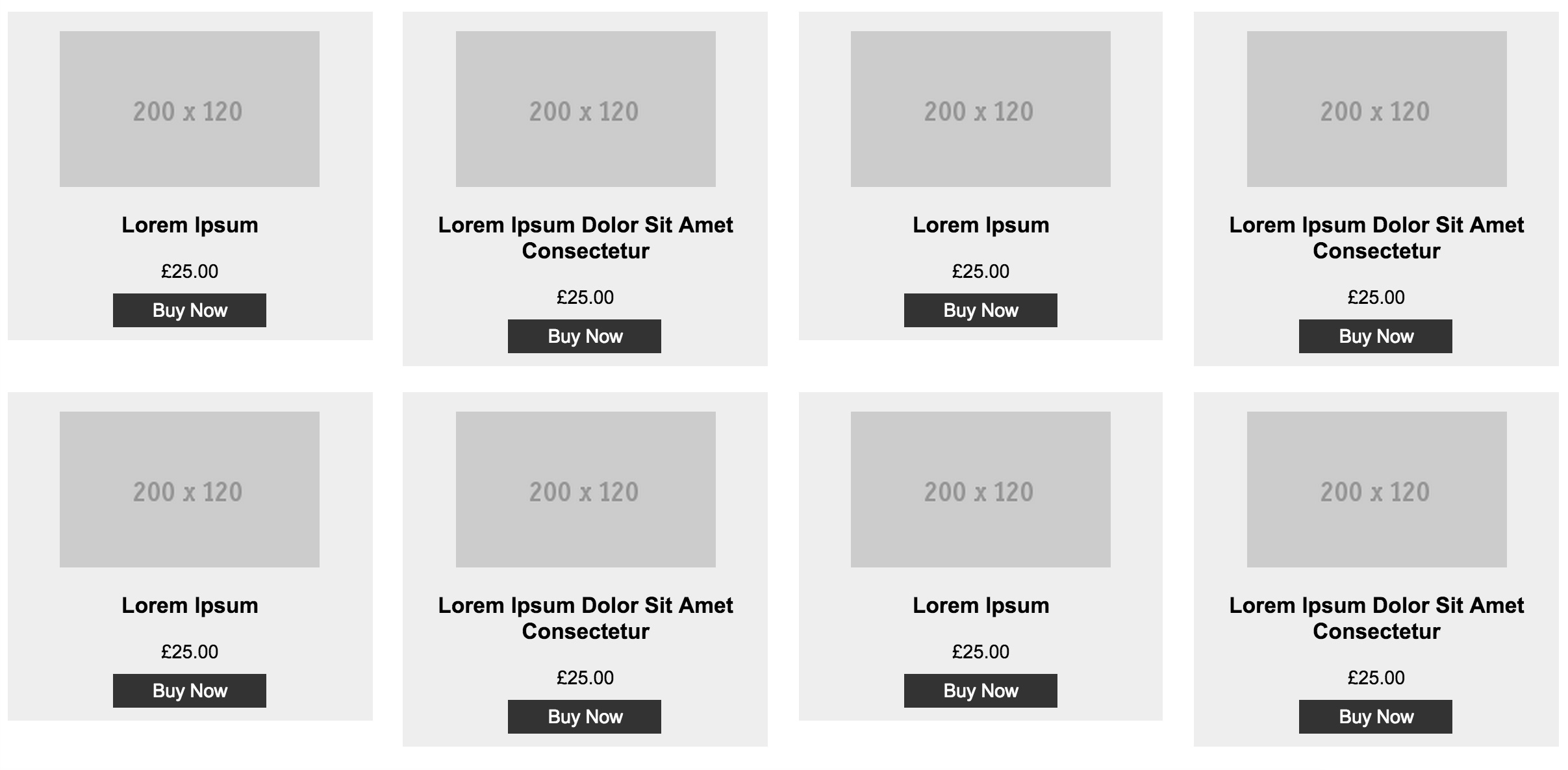
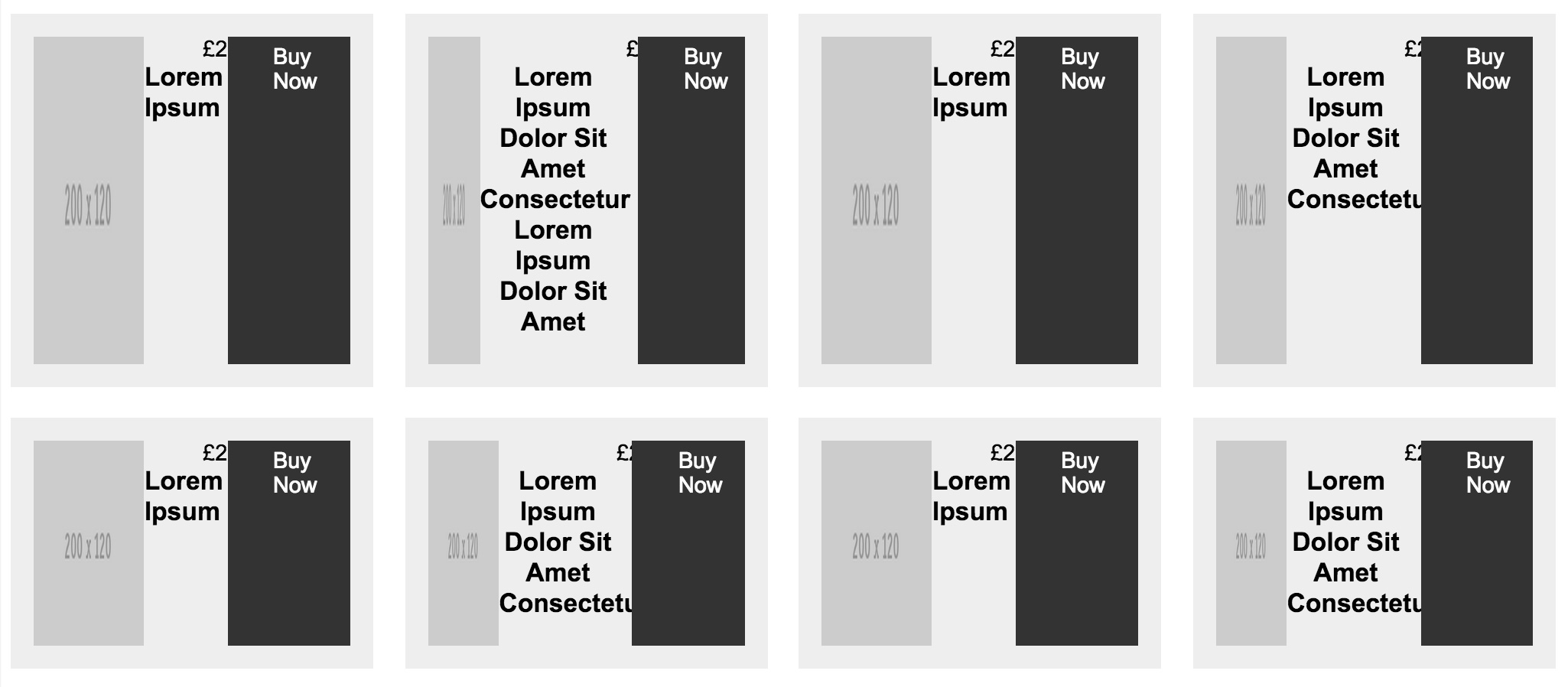
With Flexbox, equal height columns are part of the package. All it takes is display: flex; on the container and all of its children (or “flex items”) automatically stretch to the height of the parent element. Awesome. However, another default behaviour of Flexbox is to give every single child an equal amount of space on a single row, so you end up with this:
Again, it’s an easy fix. Simply add flex-wrap: wrap onto the container to enable the product items to wrap onto multiple rows.
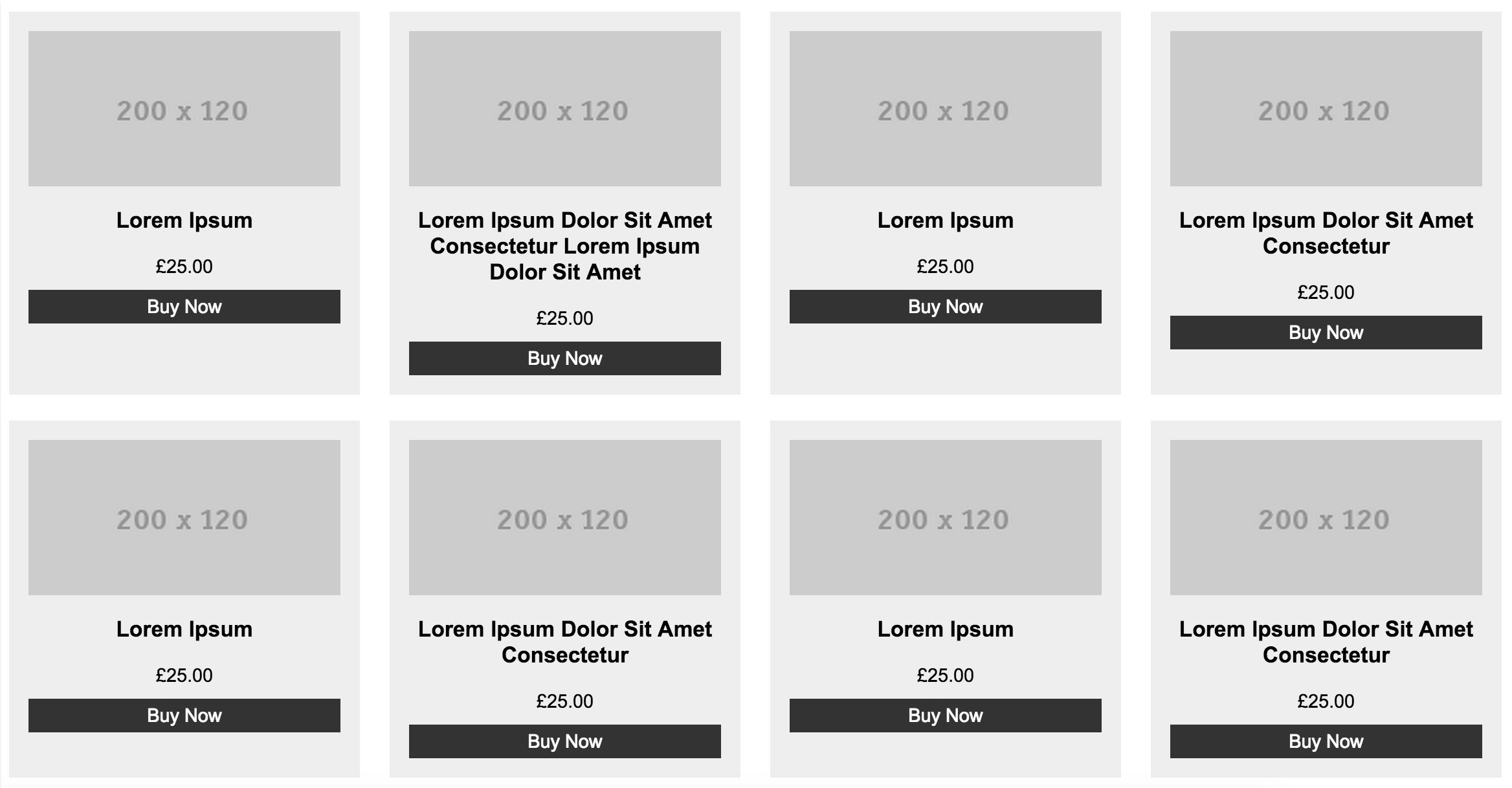
And with that, we now have a grid of product items that line up perfectly. Much nicer on the eye.
It’s not quite perfect though is it? It would be nice if those buttons could all line up nicely, too.
Aligning Content
Currently, we have a element which is the “flex container” and the
elements are the “flex items”. In order to control the content inside of the s using Flexbox properties, we need this content to become “flex items” as well. To achieve this, we simply add display: flex onto the elements.
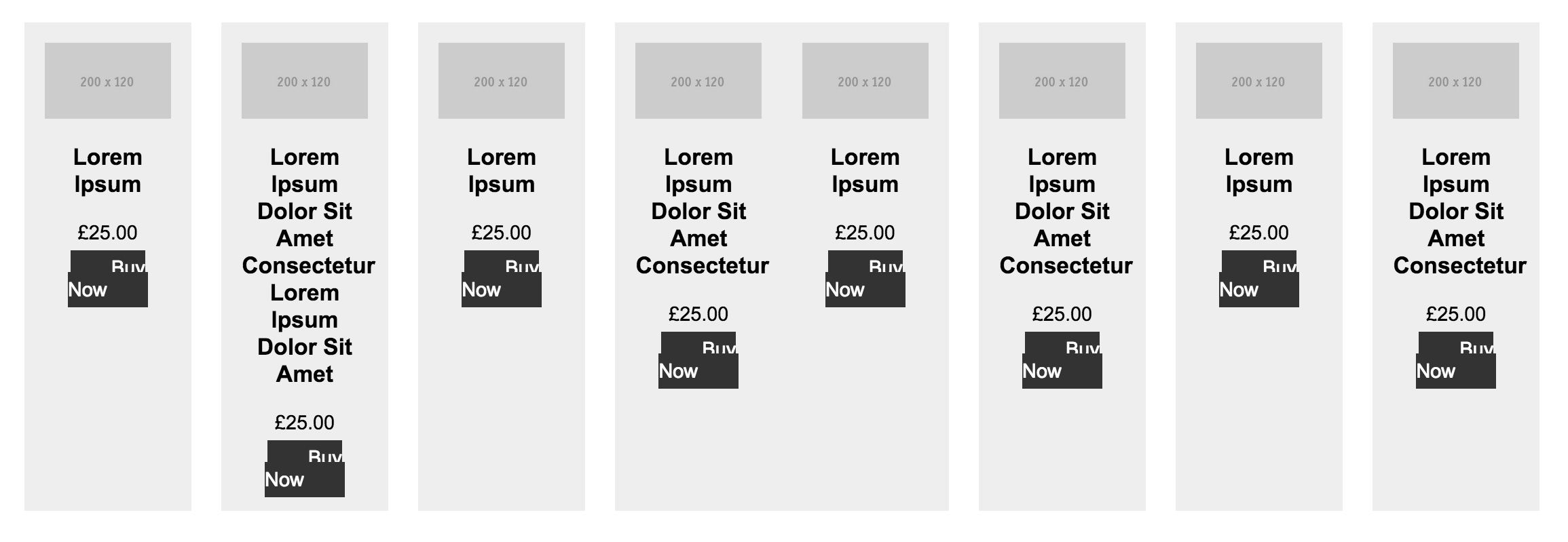
As we learnt before, the default behaviour is to put all of the children on a single row:
We could add the flex-wrap: wrap value again, but in this case it seems more sensible to add flex-direction: column, which makes the content flow vertically instead of horizontally.
You may notice that everything seems to be stretching to the full width of the container now – but why? Well, it’s basically the same reason why the equal height boxes worked. Except, because we’ve set it to flex-direction: column this stretching is happening horizontally instead of vertically.
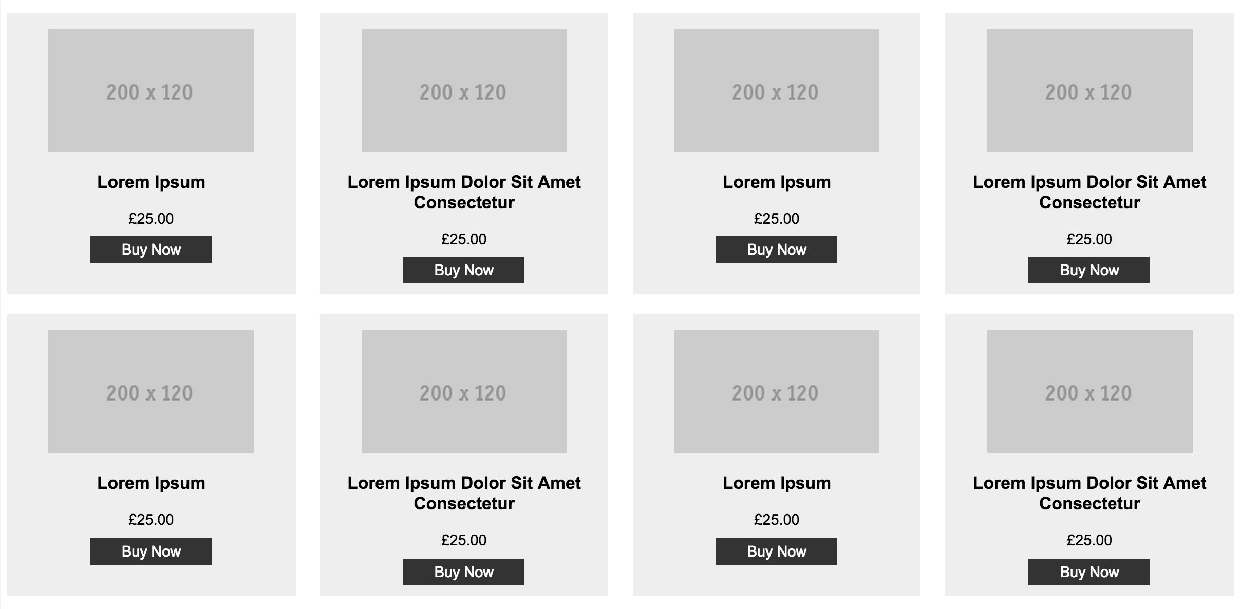
To amend this, we just need to add align-items: center. This “cancels” the stretch behaviour and simply aligns the content centrally along a vertical axis.
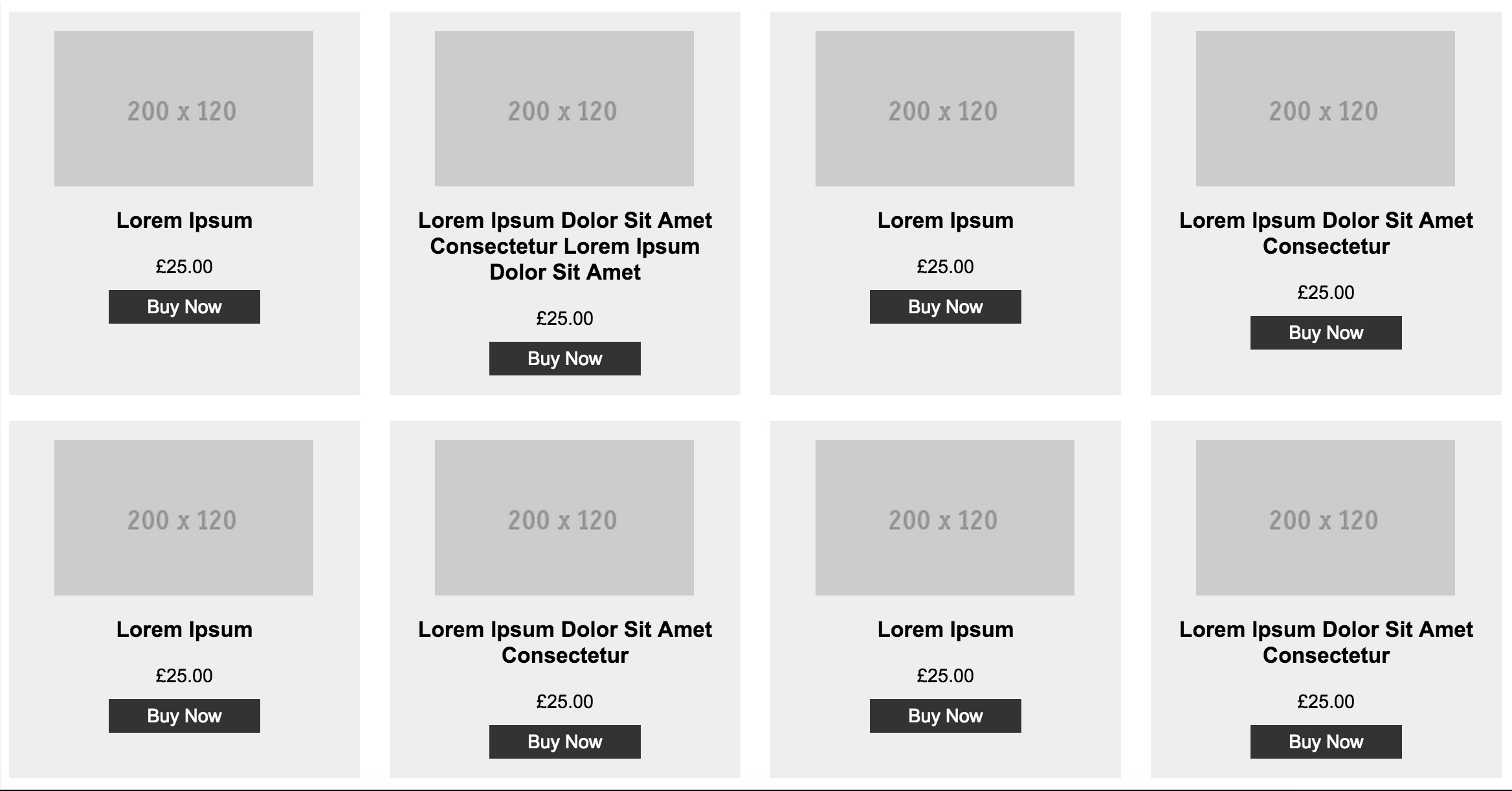
Now, where were we? That’s right, we wanted to push the “buy now” button to the bottom in every product item so that they all line up nicely. To achieve this, we just add justify-content: space-between. What this does is it aligns the first item flush to the top, the last item flush to the bottom, and then distributes the remaining space evenly between the other items. And so, we get this:
See the Pen Flexbox Product Items by Stephen Greig (@stephengreig) on CodePen.
Job done. Remember, these aesthetic niceties are simply enhancing the layout for browsers that can handle it, so there’s no reason why you can’t go ahead and use it in the real world today.
Equal Height Sidebar and Content Area
To rewind a little, I want to touch on Flexbox’s automatic stretching behaviour again, as it’s probably the reason I turn to Flexbox more and more often these days.
Another CSS annoyance that it addresses is the difficulty in achieving a sidebar and adjacent main content area with equal heights, but differing amounts of content.
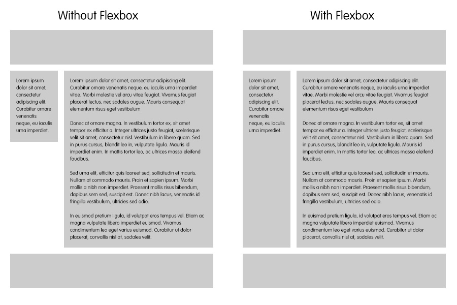
I recently put this to use on the new Cardiff City Foundation website. You can see that no matter how long the content, the sidebar always runs alongside it. To recap on how to achieve this, you simply need to add display: flex onto the containing element.
Yep, that’s it.
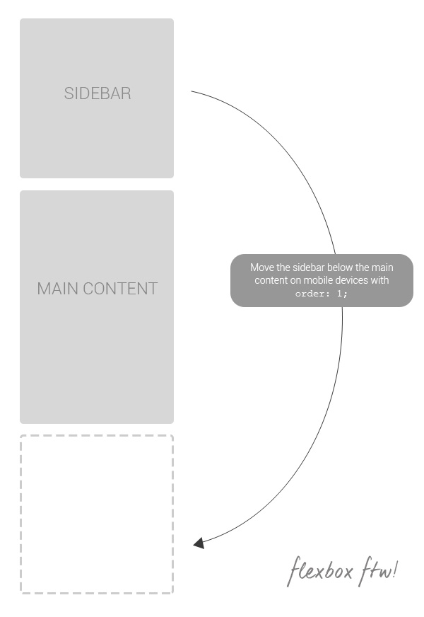
As a side-note, to adjust this layout for devices with narrower widths, you can simply add flex-direction: column to the containing element – this will make the sidebar and content elements flow vertically down the page, rather than horizontally.
But that would make the sidebar content appear before the main content on mobile devices, which is not always what you want. So how do we address this? Once again, we turn to another of Flexbox’s most attractive features.
Reordering Elements
With Flexbox’s order property, you can arbitrarily re-order the element’s on the page, despite what order they appear in in the site’s HTML. So if we take the previous layout example, the following snippet is all you need to do to push the sidebar content below the main content on mobile devices.
.sidebar {
    order: 1;
}
THAT’S IT.
Again, incredibly simple stuff. All of the flex items have a default order value of 0, so to push the sidebar element to the back of the line, you just need to give it a value above that.
In contrast to this example, I’ve also used this technique on sites with a right sidebar. On mobile devices, this sidebar will of course fall below the content area, but I often like to bring it up to the top and then make its content available through a toggle button.
I recently used this technique on my Messi vs Ronaldo Blog section. You can see there is a right sidebar containing a search bar, tags and archive links. On smaller devices, these search options would usually sit at the bottom of the page, probably never to be seen. So using Flexbox’s order property, I gave it a value of -1 when it adapts to a single column layout to bring it above the content. I have then made these search options available through a toggle button to ensure the main content is still the main focus.

Summing Up
All-in-all, it’s clear that: (a) Flexbox has a number of highly useful tools, and (b) we can start using these tools, TODAY.
Seriously, Flexbox is great for trivially solving annoyances like the ones mentioned in this article, and this kind of use isn’t going to make your site fall to pieces in browsers that don’t support Flexbox. I mean, if people using IE9 have to see a sidebar that doesn’t fill the full height of the page, or buttons that don’t line up nicely, then just consider that as part of their punishment for not updating their damn browser.
Happy flexing!
About Stephen Greig
Stephen Greig is a 25 year old Freelance Web Designer/Front-end guy, currently living in Nottingham, UK. Stephen is also the creator of messivsronaldo.net and author of CSS3 Pushing the Limits, a book on advanced CSS3. You should follow him on Twitter where he talks about the web, sports, music and swears a lot. Stephen's also on Google+ if that's more your bag.